TEXT TIPS & TRICKS
Left Justify
Whenever composing paragraphs and sentences, always remember to left justify. Justifying both left and right (full justification) can create visual issues for people with dyslexia and other sight impairments. To see what a dyslexic person sees, refer to this simulation:
Bold and Oblique
Many screen readers will not recognize bold or italics. Instead, simply use the word "Important:" preceding the text to be emphasized.
Typeface
Not to be confused with font (size and style), typeface refers to the design of the type. While debated among the accessibility community, a general heuristic is to use a sans serif typeface, such as Arial or Verdana.
Font
Font refers to the size and characteristics of the typeface. In general, you should always use 12 point or larger in electronic documents. For on-ground learning spaces, the general size heuristic is one inch of letter height for every 10' of room.
Spacing
Avoid extra spacing after sentences and after paragraphs. Generally, one space is a good heuristic. Also, avoid pressing the Return or Enter key multiple times to force paragraphs to a new page. Instead, use a Page Break.
Tabs
Use Tabs, indents, and the Ruler to align text. Never press the space bar multiple times to move the position of the text input cursor.
Color Contrast
Use color sparingly and be sure there is enough contrast. WCAG 2.0 AA guidelines specify 4.5:1 for regular type and 3:1 for type that is 18 point or larger (14pt bold). To check color contrast, we recommend the free Color Contrast Analyzer from the Paciello Group.
Color
Many users cannot distinguish colors. This is especially true among males who carry a recessive gene linked to color blindness. When conveying color to emphasize content, include alternative visual queues, such as hash marks and symbols to convey meaning.
Links
Avoid copying and pasting entire web links. Screen readers have difficulty reading long URLs. (CAST indicates short URLs are acceptable.) Instead, link to the site using natural language. If users will be printing the document, include the URL by prefacing it with the words "Web link" adjacent the natural language link. Users can also set Word to print the URL rather than natural text link. To do this, open Word > Options > Advanced > scroll down to the Print group > check the box next to Print Field Codes Instead of Their Values. When printed, the document will display {HYPERLINK "https://the.embedded.url"} Also, avoid using non-descriptive links, such as "click here" that do not describe the link destination. Finally, links should look like links. They should be the default link color and contrast, and include link focus attributes.
A good web link: Microsoft Word Help Center
A so-so web link: https://support.office.com/en-us/word
A bad web link: Click here
Headings
Always use headings. Screen readers rely on headings to navigate pages. A good heuristic is to use only one H1 per document. Reserve that H1 for the title of the document. For sections breaks use H2 and H3 headings. Be sure to keep them in hierarchical order. Never use an H3 before an H2 in the nesting hierarchy.
Bullets
Use the native/built-in bullet feature in Word. Don't ad lib bulleted lists using asterisks or other keyboard symbols. Screen readers can read Word bullets. They will have difficulty with non-native bullet lists.
Blinking text
Avoid text that blinks. Such text can induce seizures in some people.
Spacing
Use proper line spacing to improve readability. Properly using white space between paragraphs has been proven to increase comprehension up to 20%, as pointed out by usability expert Dmitry Fadeyev.
__________________________________
Good spacing aids readability. Image credit: Microsoft
Line Length
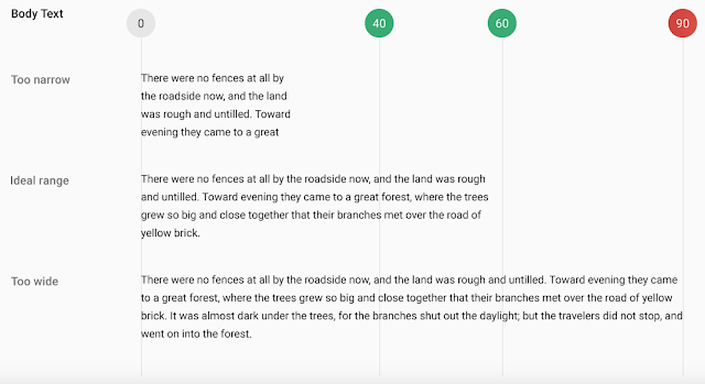
About 60 characters per line is ideal. Users can lose their place when reading long sentences up to 90 characters.
Image credit: Material Design


